Dashboard
The Dashboard answers one question fast: is the tailnet healthy right now? It is deliberately not a wall of stat cards. Its centerpiece is the coverage view - the one bold element in an otherwise quiet console.
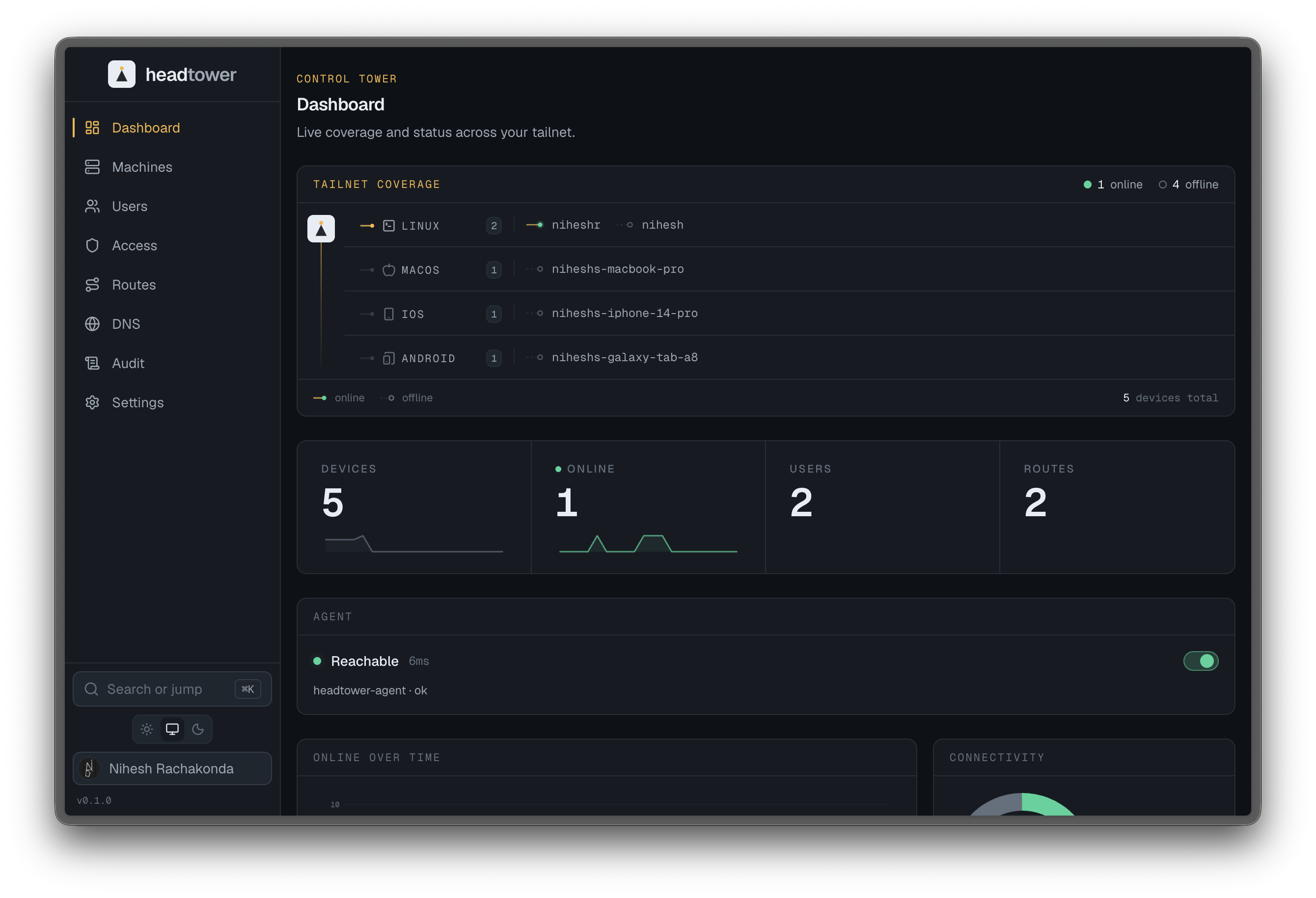
The coverage view
A schematic OS-grouped connection mesh, not a radar. A control-tower spine runs down the left edge, and every operating system present on the tailnet gets its own horizontal lane branching off it:
- Each device on a lane is drawn as its actual OS icon - a real computer, phone, or terminal glyph, not an abstract dot - so the fleet reads like a patch panel: scan lanes top to bottom to see what’s actually out there.
- A small corner light on each device marks it online (filled, pulsing) or offline (dim), and online devices wire back to the spine with a solid beacon line; offline ones with a faint dashed one.
It is pure, server-rendered geometry driven by the design tokens, so it stays crisp and flips cleanly between dark and light.
The coverage view is the deliberate exception to Headtower’s restraint. It is allowed to be expressive precisely because everything around it is calm, so your eye goes to the network’s actual state.
Status readouts
Around the coverage view sit compact, mono readouts of the figures an operator checks on a glance:
- nodes online vs. total,
- nodes with keys expiring soon,
- routes awaiting approval,
- recent activity worth noticing.
Widgets
Below the coverage view: an online-over-time graph, OS and client-version breakdowns, an agent health widget with its own enable/disable toggle, and a recent-activity feed pulled straight from the audit log. These are summaries, not dashboards-for-their-own-sake - each one is a doorway into the view where you would act on it. Nothing here is decorative; if it is on the Dashboard, it is something you would change your behavior over.